
Data visualization는 데이터로부터 정보와 가치를 추출해내는 데 중요한 역할을 한다. 파이썬은 이러한 목적에 부합하는 다양한 라이브러리를 제공하고 있는데, 여기서는 Plotly 에 대해 살펴본다.
Plotly 는 온라인 데이터 분석과 시각화 툴을 개발하는 회사로, pip install plotly 를 통해 간단하게 설치할 수 있다. 그리고 파이썬 노트북에서 임포트해오면 된다. 아래는 아나콘다 환경에서 설치하는 예이다.
(AnnaM) founder@hilbert:~$ conda install -c plotly plotly
Collecting package metadata: done
Solving environment: done

## Package Plan ##

  environment location: /home/founder/anaconda3/envs/AnnaM

  added / updated specs:
    - plotly


The following packages will be downloaded:

    package                    |            build
    ---------------------------|-----------------
    certifi-2019.9.11          |           py37_0         154 KB
    plotly-4.2.1               |             py_0         4.1 MB  plotly
    retrying-1.3.3             |           py37_2          15 KB
    ------------------------------------------------------------
                                           Total:         4.2 MB

The following NEW packages will be INSTALLED:

  plotly             plotly/noarch::plotly-4.2.1-py_0
  retrying           pkgs/main/linux-64::retrying-1.3.3-py37_2

The following packages will be UPDATED:

  ca-certificates    conda-forge::ca-certificates-2019.9.1~ --> pkgs/main::ca-certificates-2019.10.16-0
  openssl            conda-forge::openssl-1.1.1c-h516909a_0 --> pkgs/main::openssl-1.1.1d-h7b6447c_3

The following packages will be SUPERSEDED by a higher-priority channel:

  certifi                                       conda-forge --> pkgs/main


Proceed ([y]/n)? y


Downloading and Extracting Packages
retrying-1.3.3       | 15 KB     | ##################################### | 100%
certifi-2019.9.11    | 154 KB    | ##################################### | 100%
plotly-4.2.1         | 4.1 MB    | ##################################### | 100%
Preparing transaction: done
Verifying transaction: done
Executing transaction: done
전 세계 화산 정보를 담고 있는 데이터셋을 통해 ploty의 위력에 대해 살펴보자.
먼저 데이터셋의 구성에 대해 살펴보자.
import pandas as pd
df = pd.read_csv(  "https://raw.githubusercontent.com/plotly/datasets/master/volcano_db.csv", encoding="iso-8859-1")
df.head()
Number Volcano Name Country Region Latitude Longitude Elev Type Status Last Known
0 0803-001 Abu Japan Honshu-Japan 34.500 131.600 571.0 Shield volcano Holocene Unknown
1 1505-096 Acamarachi Chile Chile-N -23.300 -67.620 6046.0 Stratovolcano Holocene Unknown
2 1402-08= Acatenango Guatemala Guatemala 14.501 -90.876 3976.0 Stratovolcano Historical D1
3 0103-004 Acigol-Nevsehir Turkey Turkey 38.570 34.520 1689.0 Maar Holocene U
4 1201-04- Adams United States US-Washington 46.206 -121.490 3742.0 Stratovolcano Tephrochronology D6처음으로 눈이 가는 요소는 국가별로 분포된 화산의 수이다.
import numpy as np
import pandas as pd

df = pd.read_csv(
"https://raw.githubusercontent.com/plotly/datasets/master/volcano_db.csv", encoding="iso-8859-1")

import plotly.express as px
fig = px.histogram(df, x="Country")
fig.show()
보기 쉽도록 다음과 같이 내림차순으로 정렬도 가능하다.
fig = px.histogram(df, x="Country").update_xaxes(categoryorder="total descending")
fig.show()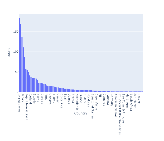
히스토그램에 추가적인 기능을 넣을 수 있다. 앞선 데이터셋을 보면 'Status'라는 항목이 있음을 알 수 있다. 이를 이용하여 모든 상태값에 대한 파이챠트를 만들어보자.
import plotly.graph_objects as go
labels=df.Status.unique()
values=df['Status'].value_counts()
fig = go.Figure(data=[go.Pie(labels=labels, values=values)])
fig.show()
앞선 국가별 정보에 Status 정보를 추가해보자.
fig = px.histogram(df, x="Country",color="Status").update_xaxes(categoryorder="total descending")
fig.show()
위 그래프에서 볼 수 있듯이 대부분의 화산의 상태는 Holocene 또는 Historical 이다.
import plotly.express as px
fig = px.bar(df, x='Volcano Name', y='Elev', color='Type', height=400)
fig.show()
여기서는 1454 개의 화산 데이터가 포함되어 있는 관계로 바차트를 통해서는 표현하기 어려운 부분이 많다. 따라서 2개의 속성만 추출해서 살펴보도록 하자.

이제 데이터셋의 새로운 섹션에 초점을 맞춰보자. 화산의 지리적위치이다. 위도와 경도라는 2개의 속성을 통해 지도상에 화산의 위치를 표시해준다. 이를 Plotly로 구현해보자.
import plotly.graph_objects as go
fig = go.Figure(data=go.Scattergeo(
        lon = df['Longitude'],
        lat = df['Latitude'],
        mode = 'markers'
        ))
fig.update_layout(
        title = 'Volcanos',
        geo_scope='world',
    )
fig.show()
마찬가지 결과를 다른 레이아웃으로도 표현할 수 있는데, 아래는 3D 글로브 맵으로 표현한 것이다.
fig = go.Figure(data=go.Scattergeo(
        lon = df['Longitude'],
        lat = df['Latitude'],
        mode = 'markers',
        showlegend=False,
        marker=dict(color="crimson", size=4, opacity=0.8))
        )
fig.update_geos(
    projection_type="orthographic",
    landcolor="white",
    oceancolor="MidnightBlue",
    showocean=True,
    lakecolor="LightBlue"
)
fig.show()
마지막으로 화산의 형태에 대한 정보를 통해 3D 로 구현해보자.
df_v = pd.read_csv("https://raw.githubusercontent.com/plotly/datasets/master/volcano.csv")fig = go.Figure(data=[go.Surface(z=df_v.values)])
fig.update_layout(title='Volcano', autosize=False,
width=500, height=500,
margin=dict(l=65, r=50, b=65, t=90))
fig.show()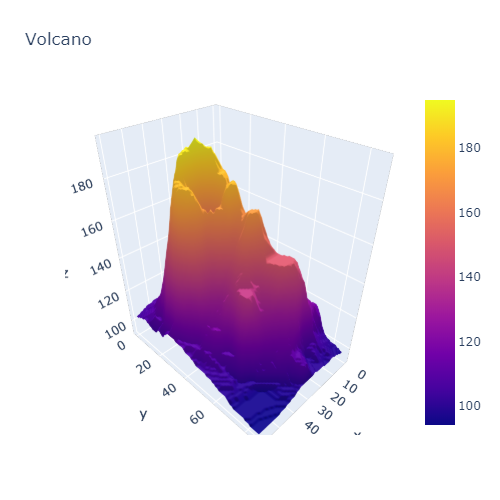
원문보기 https://medium.com/dataseries/data-visualization-with-plotly-71af5dd220b5